Capacity Report
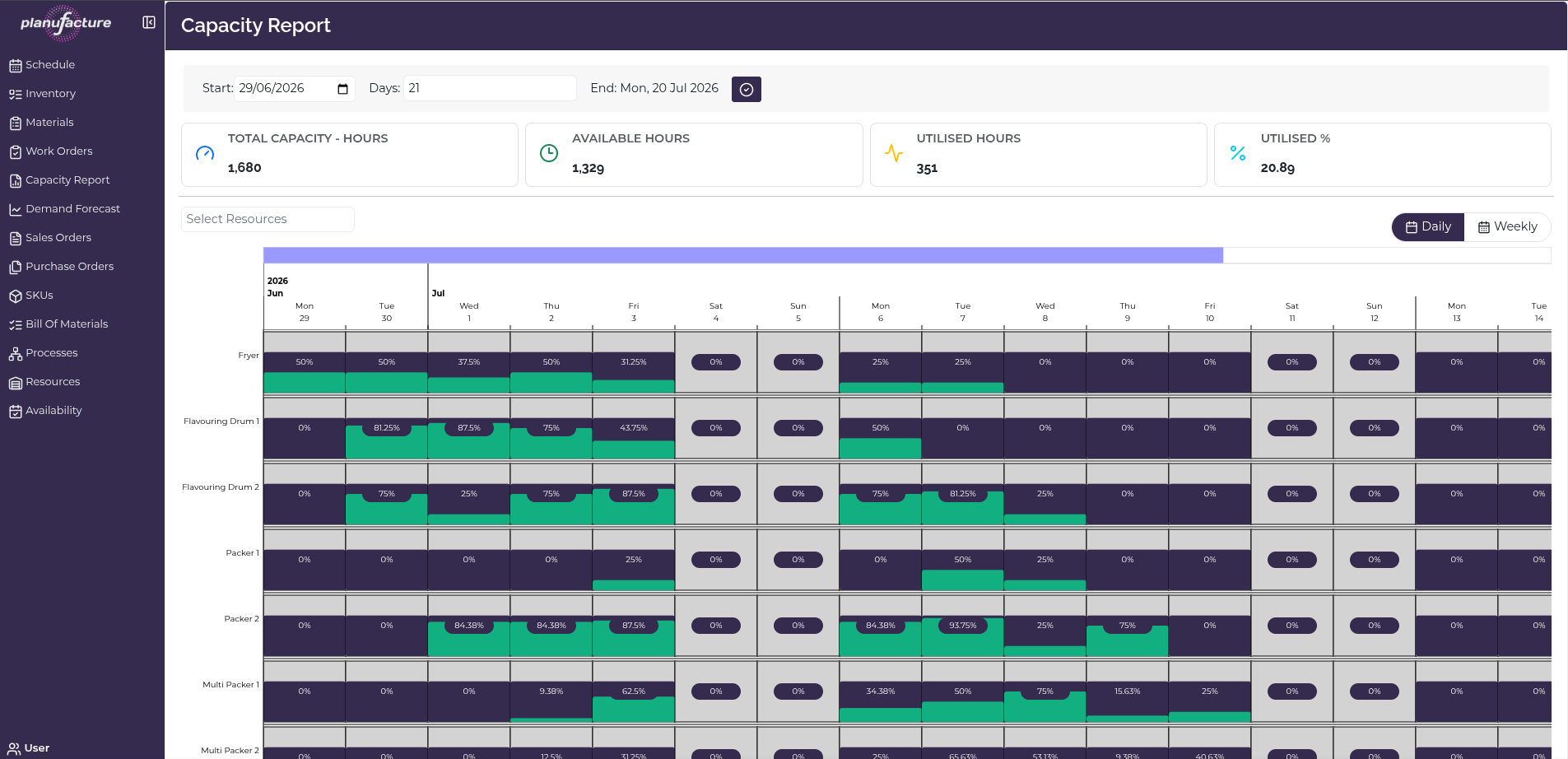
The Capacity Report provides a visual overview of resource utilisation over time, showing how capacity is being used across all resources.
Overview
- Summary metrics for total capacity, availability, and utilisation
- Visual timeline showing capacity usage by resource and date
- Daily or Weekly aggregation views
- Utilisation percentages for each resource and time period
Date Range Controls
- Start: Beginning date for capacity analysis
- Days: Number of days to display (e.g., 12 days)
- End Sat: Calculated end date
- Date picker with calendar interface
Summary Metrics
Four key metrics displayed at the top:
- Total Capacity - Hours: Maximum theoretical capacity across all resources for the selected period (e.g., 1,120 hours)
- Available Hours: Hours available for production after accounting for availability patterns, shifts, and downtime (e.g., 769 hours)
- Utilised Hours: Hours actually scheduled for production (e.g., 351 hours)
- Utilised %: Percentage of total capacity being used — calculated as (Utilised Hours / Total Capacity) × 100
Resource Filter
Select Resources dropdown:
- Filter which resources to display
- Shows all resources by default
- Useful for focusing on specific areas
View Toggle
Daily / Weekly buttons:
- Daily: Shows capacity by individual days
- Weekly: Aggregates capacity by week
- Toggle between views for different planning horizons
Capacity Visualization
Timeline Chart
Horizontal axis: Time periods (days or weeks)
- Daily view: Individual dates (e.g., Mon 30, Tue 1, Wed 2, Thu 3...)
- Weekly view: Week ranges (e.g., "2026 Jun 30", "Jul 6")
Vertical axis: Production resources (rows)
- Each row represents a resource
- Examples visible: Fryer, Flavouring Drum 1, Flavouring Drum 2, Packers 1, Packers 2, Multi Hopper
Capacity Bars
Each cell shows a stacked bar with:
- Dark purple/navy: Unused available capacity
- Teal/turquoise: Utilized capacity (scheduled production)
- Percentage label: Utilization percentage for that resource/period
Reading the bars:
- 0%: No production scheduled
- Low % (e.g., 20-40%): Light utilization, spare capacity available
- High % (e.g., 80-100%): Heavy utilization, limited spare capacity
- Over 100%: Over-capacity (if shown in red/different color)
Color Coding
- Teal/Turquoise: Scheduled production (utilized capacity)
- Dark purple/Navy: Available but unused capacity
- Gray: Unavailable time (outside availability patterns)
Common Workflows
Reviewing Overall Utilization
- Navigate to Capacity Report
- Review Summary Metrics at top
- Check Utilised % to see overall capacity usage
- Low percentage indicates spare capacity
- High percentage indicates tight capacity
Identifying Bottlenecks
- Scan the timeline chart
- Look for resources with consistently high utilization (80%+)
- These are potential bottlenecks
- Consider:
- Shifting work to underutilized resources
- Adding capacity
- Adjusting schedules
Finding Available Capacity
- Look for cells with low percentages (0-30%)
- Identify resources and time periods with spare capacity
- Use this information to schedule additional work orders
- Balance load across resources
Comparing Daily vs Weekly Views
- Start with Daily view for detailed analysis
- Switch to Weekly view for high-level trends
- Daily: Spot specific days with capacity issues
- Weekly: Understand longer-term patterns
Filtering by Resource
- Click Select Resources dropdown
- Choose specific resources
- Focus analysis on particular resources
- Useful for department-specific planning
Analyzing Time Periods
- Adjust Start date and Days to focus on specific period
- Review upcoming weeks for capacity planning
- Look back at historical periods to understand trends
- Identify seasonal patterns or recurring issues
Understanding Utilization
Healthy utilization targets:
- 60-80%: Good balance of productivity and flexibility
- Below 60%: May indicate excess capacity or underutilization
- Above 80%: High utilization, limited flexibility for changes
- Above 90%: Risk of bottlenecks and schedule inflexibility
Factors affecting utilization:
- Work order scheduling
- Resource availability patterns
- Maintenance windows
- Demand levels
- Production efficiency
Tips
- Monitor Utilised % regularly to track capacity usage trends
- Use Daily view for short-term scheduling and bottleneck identification
- Use Weekly view for strategic capacity planning
- Look for uneven utilization across resources (some overloaded, others idle)
- Balance capacity by shifting work orders between resources
- Low utilization may indicate opportunity to take on more orders
- High utilization may require capacity expansion or schedule optimization
- Compare Available Hours vs Total Capacity to understand availability pattern impact
- Use capacity insights to inform hiring, equipment purchases, or shift planning decisions
- Export or screenshot the report for capacity planning meetings
Related
- Schedule: Drag-and-drop work orders to balance capacity
- Work Orders: Review and adjust work order timing based on capacity
- Resources: Configure availability patterns to increase Available Hours
- Demand Forecast: Compare forecasted demand against available capacity